The more successful paintings for me are the ones in which the figure-ground relationship is less stable; your eye can’t completely fix on a specific area, and the surface is in constant flux. For me it keeps the painting from becoming too easily read.
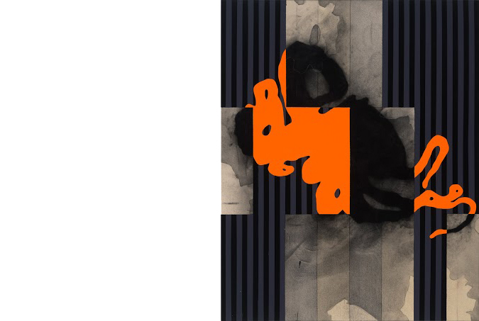
The work of painter Patrick Burns is elegant and seductive with an undercurrent of foreboding. He uses jittery silhouettes of a variety of sources as a foundation for his work that he then often covers with flat bright color blocks of layered acrylic paint composed of intense optical flashes. Ultimately the works have the ambience of lysergic-induced Southern Gulf Coast noir.
In a Gulf Coast childhood, he was exposed to car culture and discovered surfing. The glossy finishes associated with sixties custom cars stayed with him, and the individual sport of surfing drew him more deeply into a direct connection with his natural surroundings. Both surfing and car culture, with their own iconography, history, and place in contemporary culture, have been profound influences on his work.
In graduate school Burns was drawn to printmaking, and had mastered it by his early career. He then returned to painting and his work continues to bear the mark of a printmaker; he makes his canvases and paintings on panels by patiently building up surfaces and layers of color and form to achieve an overall effect and strong graphic sensibility.
After some early success in Houston during the 1990’s, the artist and his wife moved to the East Coast, first to Baltimore, Maryland and then to New York City in 2009. City life in this new environment energized and focused Burns. His productivity increased, his work matured. The artist’s current work is sharper, more vibrant, and stronger than ever before.
Following is a conversation with the artist in January 2015.
Where did you grow up and what was it like?
I grew up in LaMarque, Texas on the Gulf Coast under the shadow of Union Carbide and Monsanto. I felt the doom from day one; it fed in to this whole gothic mood of the region. It is the dark silhouette I employ in my work. Add to the landscape the doom and destruction embodied in Catholicism and it’s a wonder we ever made it out of bed. During Lent, all the statuary in the church is draped. As a kid I still knew what was underneath, especially the crucifix, but that image and the mystery of a shrouded crucifix is strongly fixed in my mind. For me, that was just one prominent experience of the surreal history of this area—Catholicism and its iconography. When this mixes with Louisiana Caribbean culture to the east and Hispanic culture to the west and south it produces a never—ending variety of mysterious, sensual and aesthetic moments.
Can you talk about your early art work and what influenced you?
I was trying to find a way back into painting from printmaking. It was the early 1980’s and I had a huge studio in an old cotton warehouse north of downtown Houston. Very early on I would prime my canvases black, because I was building a small relief on the surface with foam and or driftwood and I wanted the surface to enhance the relief not compete with it, I was very much intimidated by color and it was easier to get away with a lot, painting on a black surface. It was a total repudiation of all the brightly colored figuration of the 80’s that was dominant in Houston at that time. Eventually I began shrouding the built up relief surfaces with a light weight muslin, and then I stabilized the folds by coating them with a plaster mixture I concocted to create a ground to paint on. It was this act of shrouding and covering up that has stayed with me in form or another to this day; it’s very loaded symbolically and is my connection to the Southern Gothic-mystery that what’s on the surface is not what’s underneath. In the Flannery O’Connor story Wiseblood, the main character Hazel Moates wraps his torso with barbed wire, then hides underneath an undershirt with a white shirt and jacket. What’s on the surface is polite manners and gentility but what’s underneath is sheer horror.
Patrick Burns,
“It was this act of shrouding and covering up that has stayed with me in form or another to this day; it’s very loaded symbolically and is my connection to the Southern Gothic-mystery that what’s on the surface is not what’s underneath.”
You know your birth mother was Irish, though you have never met her. You have acknowledged that being adopted affected you but has the knowledge of being of Irish origin affected your work?
I mucked around with ideas about being Irish and the Catholic Church. The two are inseparable, especially for those of us adopted out of Irish orphanages. In my mid to late thirties, when we were in Baltimore, I made paintings that lashed out at the church but at the end of it all I was still deeply connected with the mystery of the Gulf Coast, where I grew up.
When I was forty-seven, I went to Ireland for my first and only visit. I found out I was just a visitor, a tourist and not the returning son of Eire. Still, I had an experience that provided me a great deal of comfort and ease. When I saw the Book of Kells, it gave me permission; it validated what I’d been working with for years—the inner play between geometric and organic forms, it was all right there in the border motifs of the illuminated manuscript. That structure all made perfect sense to me and so I felt something inherited, that possibly it was there from the beginning. That was a powerful experience for me personally and for my work. This showed me a beginning, a source of what I was trying to do. Then, a little over a year after that experience I got sober, and I’ve been trying to make up for lost time ever since; painting like it might be my last day. Nothing brings me greater joy.
I know you have a strong interest in music. Can you talk about that?
Music is always there for me. I can’t work without it. The effect of having music on in the studio when I’m working is subliminal. To say there’s a direct connection between certain pieces of music to the way I use color or form is not how I work. I just need the music to empty out from the day, clear my head. Some days it’s Miles Davis, some days it’s Ry Cooder, some days it’s Bozz Scaggs, some days it’s Jethro Burns and Tiny Moore, and some days it’s Freddie King.
Thelonius Monk is my all-time favorite—I love Straight No Chaser, the documentary about Monk. It was Monk’s behavior, his restlessness away from music, the spontaneous spinning he’d break into from time to time that brought me to his music, a certain kind of logic out of illogical approaches to life and problem solving. There’s a story of Monk going around within his home and skewing all the pictures hanging on the walls. His wife would then go back and straighten them. Monk would return and skew them again. This went on until his wife questioned him about it. His reply was, he was just trying to show her why he made the kind of music he did, that there’s just different ways of looking at things. I see such a simple beauty in the way he worked and thought.
Patrick Burns,
You have always exclusively used acrylic paint in your work. Why is that?
It’s what I know; it started with a set of acrylics my mother bought me when I was thirteen. Except for a few semesters in undergraduate school it’s all I’ve ever painted with. I work a lot with washes and glazes, and acrylics are made for these applications. All those years of lying on top of surfboards and seeing color suspended in a clear resin affected how I see color; suspending acrylics in clear polymer glazes is just an extension of that. I get very impatient because I layer in my paintings. I want the pigments to dry fast so I can apply the next layer, and sometimes I even work with fans to speed up the drying time. I don’t have the patience to paint with oils. Also, my experience with solvents, as a printmaker in the late 70’s to early 80’s made me sick. I needed to get back to a less toxic medium.
“All those years of lying on top of surfboards and seeing color suspended in a clear resin affected how I see color; suspending acrylics in clear polymer glazes is just an extension of that.”
Let’s back up and talk about art influences, the big ones…
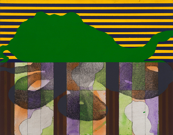
When I first got out of high school I trained as a graphic artist and the one process that took hold with me more than any other was posturization—reducing images to a straightforward black and white, positive and negative contrast, a type of silhouette. I still work with it to this day. The first museum show I saw was a retrospective of Hans Hoffman. It absolutely knocked me out and forever changed my attitude about painting. I never imagined you could achieve such things with paint, the weight, the physicality, the visual punch. The other important early influence was Forrest Bess. I believe the Museum of Fine Arts Houston at the time had only one in the collection, but what a phenomenal piece. Many years later in the early 2000’s when I was trying to figure my way out of doing paintings with horizontal striping I came across that very image again. Eighty percent of the ground was covered with an elongated grid of rectangular cells, alternately painted white and blue. The visual rhythm of the piece was Bess’ way of mimicking wave movement on the Gulf surface. But it was his amazingly intuitive application of the modernist grid; that gave me an armature to hang my silhouettes on and a way to simultaneously obstruct and reveal the central image.
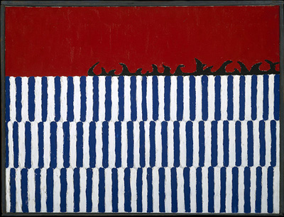
Top: Forrest Bess,
Bottom: Perry House,
Images are included under the fair use exemption.
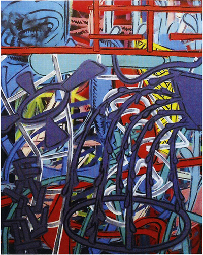
Some of the West Coast painters got my attention, primarily Billy Al Bengston and his chevron paintings. My friendship with Houston painter Perry House and close exposure to his work reinforced the importance of Bengston and his contemporaries like Ed Moses, John Altoon, and Ed Ruscha. I always had a strong affinity for them as I did Jasper Johns. With Bengston and Perry House it had a lot to do with their being acrylic painters as well. There just didn’t seem to be that many around at the time, especially in Houston. I find really good acrylic painters a rarity: they’re out there, but few and far between. It takes a certain perverse attitude to make acrylics work, it’s a difficult medium and the few acrylic painters whose work I take great pleasure in have that capacity.
Can you talk about your current work more in depth?
In the last few years the central image silhouette is chosen as much for its formal properties as its literal meaning, the cephalopods and now the thorn-thistle images. What I mean by that is that the silhouette contains an evocative presence both visually and mechanically. Mechanically, for me these images evoke certain aspects of twentieth century American painting, primarily Abstract Expressionists, the whip-like gesture of de Kooning, Pollock’s skein, Motherwell’s visceral black ovals from his Elegy to the Spanish Republic, Frankenthaler’s pour and spill process. The great thing about the silhouettes I choose is that they inherently contain a great many of these tropes. With the cephalopod images, from the Bilateral Silhouette paintings, the organic gelatinous nature of the silhouette, its gesture, is very much akin to the methods by which paint is applied to canvas in abstract painting. I choose the silhouette images for their firepower, their potency. With silhouettes an evocative image is the hook; it’s what’s going to connect with the viewer.
Patrick Burns,
“The more successful paintings for me are the ones in which the figure-ground relationship is less stable; your eye can’t completely fix on a specific area, and the surface is in constant flux. For me it keeps the painting from becoming too easily read.”
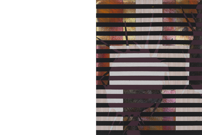
With the most recent work, the First Recollection paintings, I’ve returned to the thorn-thistle images of my earliest paintings from the mid-eighties. Formally, the First Recollection images nod to the paintings of Nicholas Krushenick, the great pop-abstractionist, but the post and lintel paintings of Brice Marden also have a lot to do with the structural geometry. The saw tooth edge of the silhouette combined with the more recent horizontal bands creates a strong optical impact, a kind of retinal flashing. The more successful paintings for me are the ones in which the figure-ground relationship is less stable; your eye can’t completely fix on a specific area, and the surface is in constant flux. For me it keeps the painting from becoming too easily read. You have to spend time with it. There is immediate visual impact, but there’s open-endedness to how the image reads. Through it all I’m as concise and clear as I can be about giving the viewer clues, because that’s what my paintings do. There is no narrative, as such; there are only hints at things, an alluding to. The point is not to make a clear concise story, because there’s no mystery in that.
[portfolio_slideshow id=6727 exclude=”7019,7010,6994,6993,6991,6990,6989,6775″]
Editor’s Notes:
Jack Livingston is an artist, educator, critic, and community activist living in Baltimore, Maryland. He was the founder and executive editor of Radar, a print magazine dedicated to Baltimore arts and Culture from 2001 through 2005. His writing on arts and culture is regularly published in a number of online and print journals. He currently is the managing editor of BmoreArt.com, Baltimore’s premier online arts and culture magazine and is co-teaching a class in interactive media and online journalism at Johns Hopkins University.
Patrick Burns is an artist living and working in New York since 2009. Previously, he lived in Baltimore, Maryland, where he taught painting and drawing at the Maryland Institute College of Art from 2003 until 2011. Most recently he curated Interior Space: small scale abstract painting, June 2013, at Long Island University in Brooklyn. His work will be included in two group exhibitions this year at Brooklyn Fireproof, and WhiteBox in New York City.
Subscribe to Tilted Arc
If you like this story, please consider subscribing. We are sticklers for privacy.
We will never sell or share your e-mail address.

-
Jen Mazza: \ /\/\/\/\/\ /\\\\\\\\\///////////\ A Painting Is A Machine
I like a painting that does something, like a machine does something: you turn it on and it functions “Since Courbet, it’s been believed that painting is addressed to the retina.…The retinal shudder!” — Marcel Duchamp1 shudder // shutter The click of the shutter, the click of the cliché, but lets come back to that […]
-

In Conversation: Gary Green with Ben Lisle
If we can see the grace in quotidian landscapes and our everyday routines then perhaps we can begin to make better choices. Gary Green, Elm City, 2015. All images: © & courtesy the artist. BEN LISLEOne of the things that strikes me first when looking at these photos is this tension between a thoroughly human […]
-
Engagement, baby’s mittens Engagement, baby’s mittens, ocean floor, Palermo rose, Lake Tahoe, timid white, Iguana green, blue echo, sycamore, Unspoken love, dark lilac, nighty night. Tomato tango, tint of mint, rustique, Petunia, modern romance, wild mush- Room, vintage claret, Celtic folklore, week- End get-away, alfresco, royal flush. Plum martini, Oklahoma wheat; Confetti, evening skyline, sun-kissed […]