Happily, the best of 2013 was not the biggest. Happily, because art–and the market that seems to drive it–has trended toward the big: the big wall-power painting and print, the gigantor sculpture; and the big spaces and names that can accommodate. But what stayed with us most from 2013 was mostly small and mostly quiet, meditative works that brought us back to the pleasures of long looking. We found the best of 2013 in some not-so unexpected places: artist studios in Bushwick and Maine; and intimately scaled museum galleries in Kansas City, Cleveland and (again) Maine. (More on this in our upcoming series, Art and Space. Stay tuned.) That said, here’s a shortlist of the best from the big, shows from the mega that kept us coming back for more:
Richard Benari
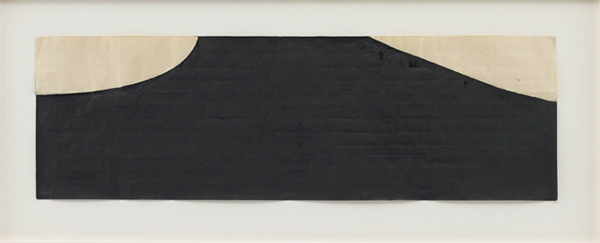
Suzan Frecon, “(measured) dark green composition.” 2012. Watercolor on old Indian ledger paper. 25.7 x 81.9 cm.
© Suzan Frecon. Image courtesy of David Zwirner Gallery, NY. Under Fair Use Guidelines.
Happily, the best of 2013 was not the biggest. Happily, because art–and the market that seems to drive it–has trended toward the big: the big wall-power painting and print, the gigantor sculpture; and the big spaces and names that can accommodate. But what stayed with us most from 2013 was mostly small and mostly quiet, meditative works that brought us back to the pleasures of long looking. We found the best of 2013 in some not-so unexpected places: artist studios in Bushwick and Maine; and intimately scaled museum galleries in Kansas City, Cleveland and (again) Maine. (More on this in our upcoming series, Art and Space. Stay tuned.) That said, here’s a shortlist of the best from the big, shows from the mega that kept us coming back for more:
Suzan Frecon: Paper
David Zwirner, New York (19th Street)
13 February – 23 March 2013
Seemingly loose contours obscure a highly deliberative process. painting plan drawing for a large painting (2004) reveals a premeditated approach to every stage in the evolution of a painting. A light pencil grid orients the delicate balance of straight and curved lines. Frecon seems to approach the paper like a canvas. Instead of allowing the ink to bleed with unpredictable fluidity, she chooses a shape and paints evenly and flat. Occasionally the ink pools or the paper resists, but otherwise there is no gesture, gradation, or depth.
More to the point:
…earthy colors suggest…but the paint application doesn’t contain enough detail to confirm… . For Frecon this is deeply important…her striving to eliminate associations from her imagery—in much the way as the Minimalists did, except in her case the results are not sterile.
Works in show: here.
Installation Vid: here.
Also at Zwirner in 2013:
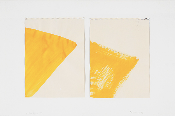
Blinky Palermo, “II Gelber Fluß.” 1976. Watercolor and graphite on 2 sheets of drawing paper mounted on cardboard. 31.4 x 23.7 cm (each). © Artist’s Estate. Private Collection, Munich. Catalogue Raisonné No. 467. Image courtesy of David Zwirner Gallery, NY. Under Fair Use Guidelines.
Palermo: Works on Paper 1976-1977
David Zwirner, New York (20th Street)
25 April – 29 June 2013
There is a balance in all these drawings between a rigorous composition and a paint handling that is more open, that takes advantage of levels of transparency and of the energy of an uneven edge.
Installation Views: here.
Installation Vid: here.
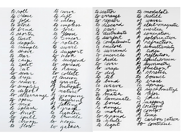
Richard Serra, “Verb List.” 1967-’68. Graphite on paper, 2 sheets. 25.4 x 20.3 cm (each).
© Richard Serra/Artists Rights Society (ARS), New York. Image courtesy of The Museum of Modern Art, New York.
Under Fair Use Guidelines.
Richard Serra: Early Work
David Zwirner, New York (20th Street)
12 April – 15 June 2013
I took a verb list and wrote it down, and thought I was going to enact these verbs in relation to space, place and time. I took a piece of lead, unrolled it and rolled it back up… . [That] got me into the manipulation of how to handle materials.
Exhibition Page: here.
Press Preview: here.
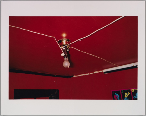
The Met:
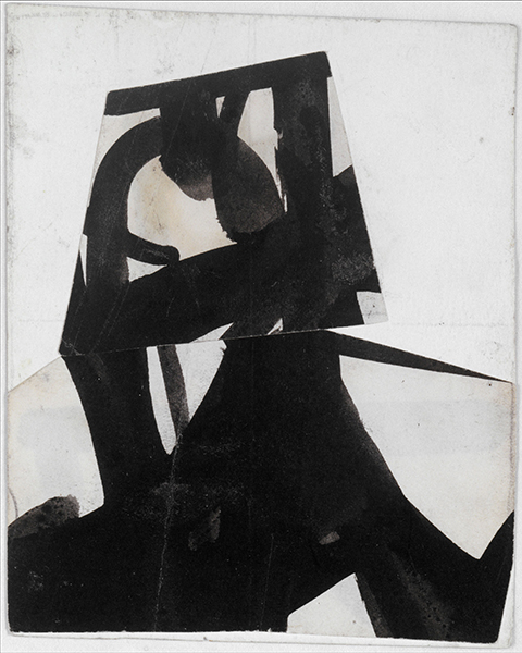
Franz Kline, “Untitled.” c. 1950-’52. Ink on cut and pasted papers. 12.1 x 9.8 cm.
© The Franz Kline Estate / Artists Rights Society (ARS), New York. Image courtesy of The Metropolitan Museum of Art, NY. Under Fair Use Guidelines.
Street
The Metropolitan Museum of Art, New York
5 March – 27 May 2013
Here, the side show was the main event. Forget James Nares’s sumptuous, hi-def vid and how it tried to put a contemporary spin on the doesn’t-need-updating-anyway genre of Street Photography. Shot in ultra slo-mo, Nares said he wanted his installation to give a “dreamlike impression of floating through a city full of people frozen in time, caught Pompeii-like [!], at a particular moment of thought, expression, or activity.”
“A film to be viewed 100 years from now,” he said.
Uh huh. For us, it was the two side galleries, filled with objects from the Met’s permanent collection, that made this show exquisite. “[C]hosen by Nares to provide different points of entry into aspects of his work,” the Met press release says. Among these, truly knockout photography by Walker Evans, Bernice Abbot and August Sander; a fragment from an Egyptian frieze, dating back to the reign of Akhenaten; Giacometti’s The Forest, and two small collaged works by Franz Kline, Untitled (c. 1950-’52), which tops this review, and Study for “Flanders” (1961).
James Nares’s Street (excerpt): here.
Ken Johnson’s kinder & gentler NYT’s review: here.
William Eggleston, “Untitled (Greenwood, Mississippi).” 1980. Photograph; Dye-transfer print. Image: 29.6 x 45.5 cm. Sheet: 40.6 x 50.8 cm. © Eggleston Artistic Trust. Image courtesy of The Metropolitan Museum of Art, NY. Under Fair Use Guidelines.
At War with the Obvious
Photographs by William Eggleston
The Metropolitan Museum of Art, New York
26 February –28 July 2013
As our friend and Tilted Arc contributor Arnold Mesches said about painting:
“Absurdity, as a concept…can transcend immediate frustration by asking the viewer to question, not only what they are seeing and feeling, but, more importantly, why they are questioning their awakened uneasiness. Hopefully, the dichotomy only increases when one is seduced by the richness of…surface and the enticing vividness of color…”
But this being Eggleston, even Arnold’s brief take may be too much. So here’s Eggleston himself, in conversation about intention; and on the importance of color and how these photographs came to be.
Pace, Chelsea:
Robert Ryman ‘Untitled.’ 2010.
© 2013 Robert Ryman / Artists Rights Society (ARS), New York. Photo by: Bill Jacobson / Courtesy Pace Gallery.
Robert Ryman: Recent Paintings
Pace (25th Street)
12 September – 26 October ’13
Different from his anyway knock-out show at Pace’s uptown gallery in 2010, Robert Ryman: Recent Paintings at Pace on 25th Street is all the more knock-out because daylight is let in. And this being Ryman, light–its kind and quality–is the whole shebang. Here, natural light makes the six small oil on cotton canvas paintings (2010-’11) in the gallery’s front room incandescent and entirely immersive. But Ryman’s ten panel No Title Required 3 (2010), which is the main event, is a harder read. High-gloss enamel and acrylic layer onto various sized (but all of them large) panels, hemmed in by blue edges. There’s hardly any visible mark–until you get moving. Once you’re in motion, you get the full effect of light and sheen, of space and extension–and of the Serra-like sense that it’s not the artwork that’s in play, it’s you.
...You forgot to enter postid in the gallery shortcode...Photos by: Kerry Ryan McFate / Courtesy Pace Gallery
© 2013 Robert Ryman / Artists Rights Society (ARS), New York.
Matthew Marks:
Luigi Ghirri, “Ile Rousse.” 1976. Vintage Cibachrome. 14 x 27 cm.
© Luigi Ghirri. Image courtesy of Matthew Marks Gallery, NY. Under Fair Use Guidelines.
Luigi Ghirri: Kodachrome
Matthew Marks, NY (22nd Street)
6 March – 20 April 2013
…I always think of Ghirri as the Italo Calvino of photography: Like Calvino…Ghirri engages in very close observation of the everyday world, but always manages to find the surreal in it – but again like Calvino, the strangeness seems more profound and structural than merely freaky.
Works in show: here.
Installation Vid: here.
Brice Marden, “Untitled.” 1977. Graphite and beeswax on Arches 300lb Torchon (Rough) Natural White paper. 56 x 76 cm. © Brice Marden. Image courtesy of Matthew Marks Gallery, NY.Under Fair Use Guidelines.
Brice Marden: Graphite Drawings
Matthew Marks, NY (24th Street)
9 November – 21 December 2013
…that always stuck with me, the idea that you could make a finished drawing. It’s one of those things I really liked about Jasper Johns, because here was a guy who came along who was really making finished drawings. The drawing stood as a statement. It wasn’t a study or something on the way toward something else, and so I always had that in mind about drawing. A drawing is a complete experience in itself.
–Brice Marden, in conversation with Whitney Museum curator Janie C. Lee. (Lee, Janie C. Brice Marden Drawings: The Whitney Museum of American Art Collection, Whitney Museum of American Art/Harry N. Abrams, Inc., New York; 1998. p. 21.)
Works in show: here.
Installation Vid: here.
Up next: The best small-scale shows of 2013. Stay tuned.
Subscribe to Tilted Arc
If you like this story, please consider subscribing. We are sticklers for privacy.
We will never sell or share your e-mail address.

-
Jen Mazza: \ /\/\/\/\/\ /\\\\\\\\\///////////\ A Painting Is A Machine
I like a painting that does something, like a machine does something: you turn it on and it functions “Since Courbet, it’s been believed that painting is addressed to the retina.…The retinal shudder!” — Marcel Duchamp1 shudder // shutter The click of the shutter, the click of the cliché, but lets come back to that […]
-
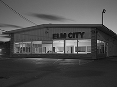
In Conversation: Gary Green with Ben Lisle
If we can see the grace in quotidian landscapes and our everyday routines then perhaps we can begin to make better choices. Gary Green, Elm City, 2015. All images: © & courtesy the artist. BEN LISLEOne of the things that strikes me first when looking at these photos is this tension between a thoroughly human […]
-
Engagement, baby’s mittens Engagement, baby’s mittens, ocean floor, Palermo rose, Lake Tahoe, timid white, Iguana green, blue echo, sycamore, Unspoken love, dark lilac, nighty night. Tomato tango, tint of mint, rustique, Petunia, modern romance, wild mush- Room, vintage claret, Celtic folklore, week- End get-away, alfresco, royal flush. Plum martini, Oklahoma wheat; Confetti, evening skyline, sun-kissed […]