My own personal, most dominate, influence as an American painter from the beginning has always been de Kooning and to this day I don’t think I have ever gotten over “Pink Angels” simply for the way in which de Kooning uses line as an articulating, overlapping depth element and for the way he plunges that extraordinary…
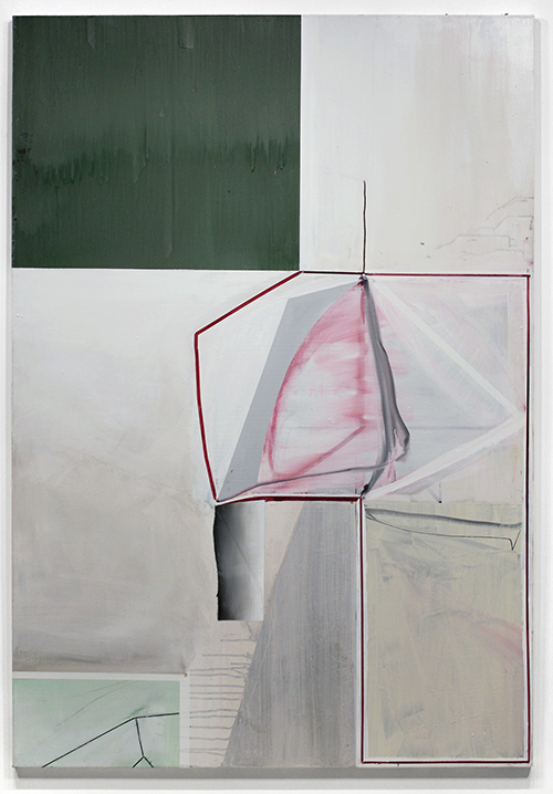
Gordon Moore, “Untitled (with Green)”, 2013. Oil, pumice and latex on canvas. 78 x 54 1/4 inches. © Gordon Moore. Courtesy of Betty Cuningham Gallery.
I’ve been to see painter Gordon Moore‘s current show at Betty Cuningham Gallery multiple times. Every time I do, I think I’m going to finally understand them, or answer an unknown question—maybe about the paintings, maybe about his process, maybe about myself.
I keep what Joan Waltemath had to say about Gordon’s last show fresh in my mind, “The falling paint on many surfaces creates pathos, an awareness of what is momentary, of what can be caught only once; the painting’s structure gives us what is lasting, what is stable, what holds us together.”
There’s something about the deceptively flat blocks he uses as a foundation for the paintings. I get lost in their subtle variations of tone, only to be jolted out of my contemplation by incredible marks or lines that carry the weight of depth with them. It’s in that shift—between the flatness and the depth—that I remember. I’ll never be able to fully understand. The experience is one of heightened awareness—it testifies to the power of an experienced hand leading his viewer to a safe space to lose themselves.
We asked Gordon to respond to five topics, some quite specific, some general. We begin with dimensionality and will continue the conversation, throughout the week, in 4 consecutive posts.
—
I
The suggestion of an element of dimension or illusion in painting has been interesting to me for some time simply because it was considered as totally verboten for so long in the eyes of many. After Matisse we very quickly reached a point where flatness became the litmus test for purity in painting. In my view the principal elements of Matisse: Flatness, Saturated Color and Patterning come directly out of Gauguin and his ecstatic experiences in Tahiti. But Picasso did not choose to fondle that “hot patato.” I’ve heard it expressed by some artists that as a consequence Picasso (through cubism) ends up being more a sculptor than a painter and Matisse (through flatness) more a painter than a sculptor simply because one (Picasso) chose to deal with dimension more than the other even though both worked in the two mediums. I’ve always felt very uncomfortable with that categorical a distinction as a value judgment. Both are equally potent directions for painting depending on how one handles them. My own personal, most dominate, influence as an American painter from the beginning has always been de Kooning and to this day I don’t think I have ever gotten over “Pink Angels” simply for the way in which de Kooning uses line as an articulating, overlapping depth element and for the way he plunges that extraordinary “hammer head shark”- like shape into the middle of that extraordinary painting. It seems literally “thrust” into the center and the “tail” on it has just the slightest articulation of modeled dimension, which gives it such physical presence. That communicates. Anyone walking through the de Kooning retrospective at MoMA would have to acknowledge de Kooning’s debt to Picasso. The two most important paintings for me becoming a painter were “Les Demoiselles d’Avignon” and “Pink Angels.”
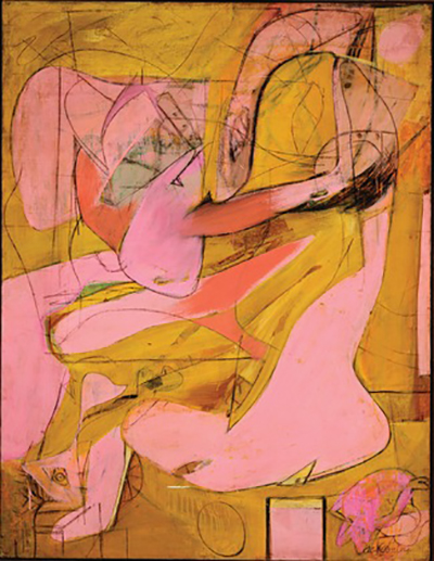
Willem de Kooning. Pink Angels. c. 1945. Oil and charcoal on canvas, 52 x 40″ (132.1 x 101.6 cm). Frederick R. Weisman Art Foundation, Los Angeles. © 2011 The Willem de Kooning Foundation/Artists Rights Society (ARS), New York. (Used here under Fair Use guidelines.)
The Picasso because of that cubist “faceted” unfinished-like touch which alludes to dimension and the de Kooning because of his overlapping line and that “shaft” on the “tail” of that shape. Both give dimension to each work. But by the time we get to what was being referred to as “Greenbergian Formalism” in the late 60’s and early 70’s, when I first showed up in New York out of Graduate School in New Haven (1972), Greenbergs influence was so pervasive that painting in the eyes of many critics had been reduced to, as Leo Steinberg succinctly put it: “stripping painting down to its irreducible essence, i.e. the coincidence of flattened color with its material support.” This very perceptive observation occurred in Leo Steinberg’s brilliant essay printed in Artforum in 1972 (the year I came to New York) entitled “Reflections on the State of Criticism” which was nothing less than a highly perceptive assault on Greenbergs complete dismissal of Rauschenberg and Greenbergs cultural hegemony in the art world at the time, in which Steinberg referred to the mind-set cultivated by Greenbergs polemics as: “Preventive Aesthetics.” Though I read it several years after it first appeared, it hit a very responsive chord with me in part because I had never felt comfortable with “taped graphics” which so much of the painting being done then looked like to me. I remember saying to several artists then that “every time I looked at a late 60’s early 70’s painting all I could see was 50,000 miles of masking tape.” 3M stock must have gone through the roof at the time just from their profits in the Art World! So it was in part my negative reaction to taped, hard-edge painting, as well as my positive response to the potential alluded to in both Picasso’s and de Kooning’s suggested gestural dimension and use of line, that never stopped being a potential source for me. I want just enough of a “fragment” of dimension in the work as an allusion to real space as a way of reminding the viewer that it is just a painting, but a painting that was arrived at through an emotive, spontaneous experience with life in and outside of the painting of it. That slight sense of dimensional space will (hopefully) pull one into the picture, as if falling forward to a point to where you’re not sure where you will end up and you do not overly care. The experience of falling forward and pulling you in are what it’s about.
Having said that, this is rather tricky stuff to pull off because it’s very easy to fail through over illusion which is tantamount to pictorial death. All in all, I’m ok with that, because in my book “where there is no risk there is no art.” I’m not the least bit interested in making just safe product as art. Each work is in a sense an “aesthetic journey” and an important part of that journey is the possibility of failure. Informed intuition is the guiding principal of abstraction for me. I always have an idea when I begin work, but only a vague idea; and in any event that idea must never obfuscate discovery made along the way.
spacer
Up next:
“No one would have, even to this day, conceived of the question: ‘Is drawing dead?’ That would never ever occur to someone. So the question then became: What is it that happens when we go from drawing to painting that so many people seem anxious to kill?”
Our conversation with Gordon Moore continues.
Editor’s Recs:
Gordon Moore’s current show at Betty Cuningham Gallery is up until February 8th.
To view a video of Gordon talking about his process and approach to painting, please click here.
spacer
.
.
.
.
Subscribe to Tilted Arc
If you like this story, please consider subscribing. We are sticklers for privacy.
We will never sell or share your e-mail address.

-
Jen Mazza: \ /\/\/\/\/\ /\\\\\\\\\///////////\ A Painting Is A Machine
I like a painting that does something, like a machine does something: you turn it on and it functions “Since Courbet, it’s been believed that painting is addressed to the retina.…The retinal shudder!” — Marcel Duchamp1 shudder // shutter The click of the shutter, the click of the cliché, but lets come back to that […]
-
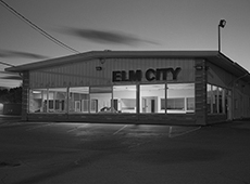
In Conversation: Gary Green with Ben Lisle
If we can see the grace in quotidian landscapes and our everyday routines then perhaps we can begin to make better choices. Gary Green, Elm City, 2015. All images: © & courtesy the artist. BEN LISLEOne of the things that strikes me first when looking at these photos is this tension between a thoroughly human […]
-
Engagement, baby’s mittens Engagement, baby’s mittens, ocean floor, Palermo rose, Lake Tahoe, timid white, Iguana green, blue echo, sycamore, Unspoken love, dark lilac, nighty night. Tomato tango, tint of mint, rustique, Petunia, modern romance, wild mush- Room, vintage claret, Celtic folklore, week- End get-away, alfresco, royal flush. Plum martini, Oklahoma wheat; Confetti, evening skyline, sun-kissed […]